EEN118 LAB NINE
This lab is all about data-processing. You will be reading information from a file that contains nearly 100,000 individual pieces of data, far too much for a person to deal with, but displaying it in a form that is very easy to understand.
For this lab, you will probably need to download an updated version of the library, you need at least version 1.04.006. You will also need to download the large data file " weather.txt " from the class web page.
The file weather.txt contains automatically recorded meteorological data from a recording station in Fort Collins, Colorado. Every hour of every day for the whole of 1999 (except for just 10 hours when something went wrong), the date, time, temperature, humidity, wind speed, wind direction, and atmospheric pressure were recorded. The file contains one line for each hourly observation. Here is one sample line taken from near the middle of the file:
1999 07 04 1500 +094 014 005 213 634
The nine numbers represent: year, month, day, time, temperature (in degrees Fahrenheit), humidity (percent), wind speed (in miles per hour), wind direction (in degrees, with 0=North, 90=East, 90=South, etc), and atmospheric pressure (in millimetres of mercury). So that one sample line shows that on 4th July 1999 at 3pm, the temperature was 94°F, the humididy was only 14%, the wind was blowing at 5mph from approximately the South-South-West, and the pressure was 634mmHg.
Display every temperature recording on a convenient graph.
Write a program that opens a graphics window approximately 400 pixles wide and 100 pixels high. The horizontal axis will represent the day of the year (so you'd expect only to need 365 pixels) and the vertical axis will represent temperature.
Read every hourly record from the file, and plot a point at x =day-of-year, y =temperature. You will have 24 dots at each x position.
To simplify the calculations, you may pretend that every month is 31 days long, so day d of month m becomes day (m-1)*60+d of the year. You should produce a graph looking just like this:

Get the dates right.
There aren't really 31 days in each month, and that simplifying assumption leaves gaps in the graph. The large gap at the end of February is quite noticeable. You need to be able to convert day and month to the true day of the year. Fortunately, you wrote a program that performs that calculation in step 2 of lab 7. Just copy that bit of program to get the right day-of-year number, and then you can make the window exactly the right size.
Make it clearer.
All those dots are a bit too much. Usually the only information a person wants from a temperature graph is the daily minimum and maximum.
Modify your program so that for each month it only plots two points: one showing the highest temperature on that date, and the other showing the lowest.
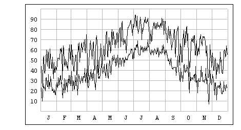
You may think your results look wrong, but there is a lot of variation between one day's extreme temperatures and the next's at high elevations. Expect a very fuzzy-looking graph:

Improve it.
Even though that graph is technically correct, it really isn't very good. It is so fuzzy that you can't really get a good idea of what was happening to temperatures from day to day. To fix this, change from drawing dots to drawing lines. There should be one continuous red line showing how the maximum temperature varies from day to day, and a spearate continuous blue line showing the minimum temperature. Be careful that the two lines don't get confused.

That's more like it, but there's still room for some improvement...
Finally. (Extra Credit)
Put some visual aids in there. At the very least draw a grid (in grey, so that it isn't too intrusive) showing a vertical line on the first day of each month, and a horizontal line at each ten-degree interval. Draw the grid before drawing the graph, so that the graph is drawn on top.
It would be even better if you could add letters along the bottom indicating which month is which, and numbers up the side showing the actual temperatures each horizontal line represents. You may want to change the vertical scale so that the numbers aren't squeezed too closely together.

You know the rules for extra credit by now: make it look like the results of a professional product, a graphic that wouldn't look out-of-place in an expensive book.